Creating an Angular Dashboard Layout - Content Grid
Published on
The next thing we need for our dashboard layout is some sort of grid that we can use to layout our pages. In the past it was common to use a CSS grid library, bootstrap probably being the most popular. Now that we have CSS Grid, building a grid with pure CSS is relatively easy.
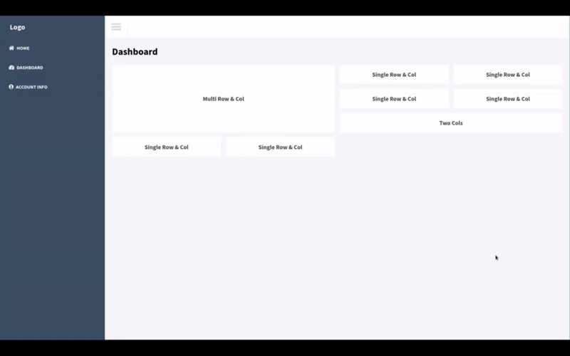
We are going to build reusable Angular grid components for our dashboard. Each grid cell will be customizable in that we will be able to specify how many columns and rows to span by using element attributes. Our project result will resemble something like this…
Prerequisites
- Install Node
- Install Angular CLI
- Creating an Angular Dashboard Layout - Framing
- Creating an Angular Dashboard Layout - Theming
- OR Clone this github repository
Creating Our Components.
For our Angular grid we will need two things, a component to act as a grid container and an attribute directive to mark our grid cells. Both of these are relatively easy to create.
Lets generate our grid container component and grid cell directive in our shared module…
ng generate component shared/components/grid/grid-container
ng generate component shared/components/grid/grid-cell
We will also need to updated our shared module file to export our two new components.
import { NgModule } from '@angular/core';
import { CommonModule } from '@angular/common';
import { RouterModule } from '@angular/router';
import { NavigationBarComponent } from './components/navigation-bar/navigation-bar.component';
import { NavigationSidePanelComponent } from './components/navigation-side-panel/navigation-side-panel.component';
import { SingleDoubleClickDirective } from './directives/single-double-click.directive';
import { GridContainerComponent } from './components/grid/grid-container/grid-container.component';
import { GridCellComponent } from './components/grid/grid-cell/grid-cell.component';

@NgModule({
  declarations: [
    GridCellComponent,
    GridContainerComponent,
    NavigationBarComponent,
    NavigationSidePanelComponent,
    SingleDoubleClickDirective
  ],
  imports: [
    CommonModule,
    RouterModule
  ],
  exports: [
    GridCellComponent,
    GridContainerComponent,
    NavigationBarComponent,
    NavigationSidePanelComponent,
    SingleDoubleClickDirective
  ]
})
export class SharedModule { }
Creating Our Grid Container Component
Our grid container will consist of a single div with an ng-content element. By using ng-content, we are able to put HTML content between our grid component element tags and have the content rendered in place of the ng-content element. We are also going to use CSS Grid to structure our grid.
Our grid container HTML…
<div class="grid-container">
  <ng-content></ng-content>
</div>
And our grid container CSS…
.grid-container {
  position: relative;
  max-width: 100%;
  display: grid;
  grid-template-columns: repeat(auto-fill, minmax(300px, 1fr));
  grid-template-rows: minmax(10px, auto);
  grid-auto-flow: dense;
  grid-gap: 1rem;
}

:host ::ng-deep  [gridCell] {
  display: block;
  font-size: 20px;
  padding: 20px;
}

@media only screen and (max-width: 767px) {
  :host ::ng-deep [gridCell] {
    grid-column: span 2 !important;
  }
}
You will notice in our CSS that we are using :host and ::ng-deep to target all content elements that contain our gridCell attribute directive. This has been the only way I’ve found that doesn’t break CSS Grid with Angular nested components.
Creating Our Grid Cell Directive
We don’t need a template for our grid cell which why we chose to use a directive over a component. Our directive’s only job is to apply CSS properties to the element that the directive is applied to in order to set the cell’s span values.
Our directive will make use of the native element by injecting ElementRef in to the constructor. We will use this ElementRef instance to get the attribute values we set for gcColSpan and gcRowSpan and apply these values to the CSS Grid properties grid-row and grid-column. This will allow us to set different column and row spans for different cells. If no attributes are set, column and row spans will both be set to 1 by default.
Let create our directive…
import { Directive, ElementRef } from '@angular/core';

@Directive({
  selector: '[gridCell]'
})
export class GridCellDirective {
  constructor(private el: ElementRef) {
    const columns: number = el.nativeElement.getAttribute("gccolspan");
    const rows: number = el.nativeElement.getAttribute("gcrowspan");
    el.nativeElement.style.gridColumn = `span ${columns || 1}`;
    el.nativeElement.style.gridRow = `span ${rows || 1}`;
  }
}
Using Our Grid
Now that we have our grid container component and our grid cell directive, we’re ready to put them to use. In the previous post we generated a blank dashboard page component. We will use this page to demonstrate our grid.
All we really need to do is update our template HTML file…
<div class="page-container">
  <h1>Dashboard</h1>
  <app-grid-container>
    <div gridCell gcColSpan="2" gcRowSpan="3" class="card card-body">
      <h4>Multi Row & Col</h4>
    </div>
    <div gridCell class="card card-body">
      <h4>Single Row & Col</h4>
    </div>
    <div gridCell class="card card-body">
      <h4>Single Row & Col</h4>
    </div>
    <div gridCell class="card card-body">
      <h4>Single Row & Col</h4>
    </div>
    <div gridCell class="card card-body">
      <h4>Single Row & Col</h4>
    </div>
    <div gridCell gcColSpan="2" class="card card-body">
      <h4>Two Cols</h4>
    </div>
    <div gridCell class="card card-body">
      <h4>Single Row & Col</h4>
    </div>
    <div gridCell class="card card-body">
      <h4>Single Row & Col</h4>
    </div>
  </app-grid-container>
</div>
You can see our grid cell directive being use on each div between our app-grid-container element which designates those divs as cells of our grid. There are also a couple div cells that make use of gcColSpan and gcRowSpan to set our column and row span values.
We also need to add some general CSS styles to our root styles.scss file…
.page-container {
  margin: 1.5rem 1.5rem;
}

.card {
  &.card-body {
    background:#FFFFFF;
    color: #444;
    display: flex;
    flex-grow: 1;
    transition: background 0.5s;
    cursor: pointer;

    &:hover {
      background: #d9d9e2;
      color: #000;
    }
  }
}
Stackblitz Result
Now we have a grid that we can use with our dashboard layout. Below I’ve embedded a live Stackblitz example of our dashboard layout and grid.
Note: The menu button responds to single and double clicks. Single opens/collapses the side panel. Double opens/closes the side panel. A full screen demo can also be viewed here
The completed github repository can be found here